>>>>>>
- Tables
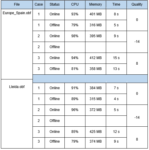
Tables are relatively straightforward. They are the easiest way to present your raw data. However, you should not just dump all your raw data into them without first filtering, ordering and categorizing them. This categorization should be clearly marked by giving each column a logical heading. Although you must keep headings short, they must be understandable – in other words, better long than unintelligible. Tables are not designed to show trends or patterns; this is what figures are for.Table 1. Values monitored in the testing (CPU load, memory use, time per search, and quality of the route) for each data file, each case and online/offline status (Adapted from Cuadrat, 2012 )
- Figures
Figures, in turn, provide a visual depiction of your data that often makes it easier to highlight trends or key findings. There are a wide range of different types of figures: from photographs and illustrations to pie charts and scattergrams. The best choice in each case will depend on the type of data you have and the point you want to make. If you are not sure which format is best, try presenting the data in a number of formats and then choose the one which presents your data most clearly.
Photographs, illustrations and screenshots can present information quickly and easily; their use should be clear. Maps are an obvious example.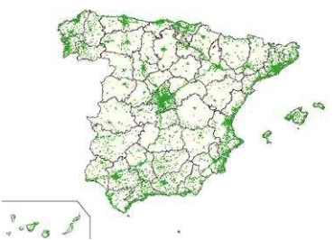
Figure 1. Areas with 3G coverage in Spain (Adapted from Cuadrat, 2012 )
However, generally speaking, you will have a greater need for the typical types of figures used to portray data visually: bar charts, pie charts, line graphs, scattergrams, etc.
Bar charts are best used to easily compare one variable in different categories.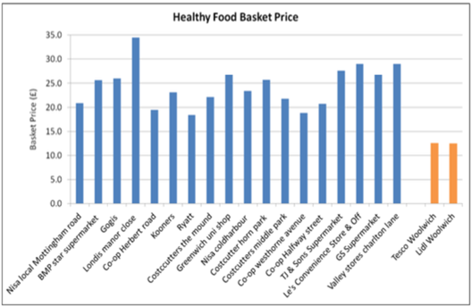
Figure 2. Prices of the healthy food basket in 18 shops in deprived areas with poor access to healthy food (blue) and in 2 large supermarkets (orange) (Adapted from Duval, 2016 )
Pie charts can be used to compare proportions.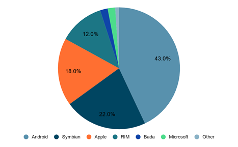
Figure 3. Share of worldwide 2011 smartphone sales to end users by operating system (Adapted from Cuadrat, 2012 )
Line graphs can be used to illustrate change; they are often used to illustrate change over time, for example.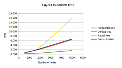
Figure 4. Layout execution time (Adapted from Ciberta, 2014 )
Scattergrams are used to illustrate two variables simultaneously and are often used to highlight a pattern or trend.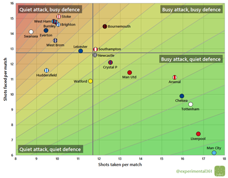
Figure 5. Premier League: shots taken vs. faced per match (2017/18) (Adapted from Mayhew, 2018 )
These are common types of figures, but there are many other kinds. Take advantage of tools like MS Excel or Google Sheets to experiment with different formats until you find the ideal way to present your data clearly and coherently.
Recommended citation:
«Examples from the literature» [en línia]. A: Llibre d’estil de la Universitat de Barcelona. Barcelona: Universitat de Barcelona. Serveis Lingüístics. <https://www.ub.edu/llibre-estil/criteri.php?id=3428> [consulta: 20 maig 2024].


